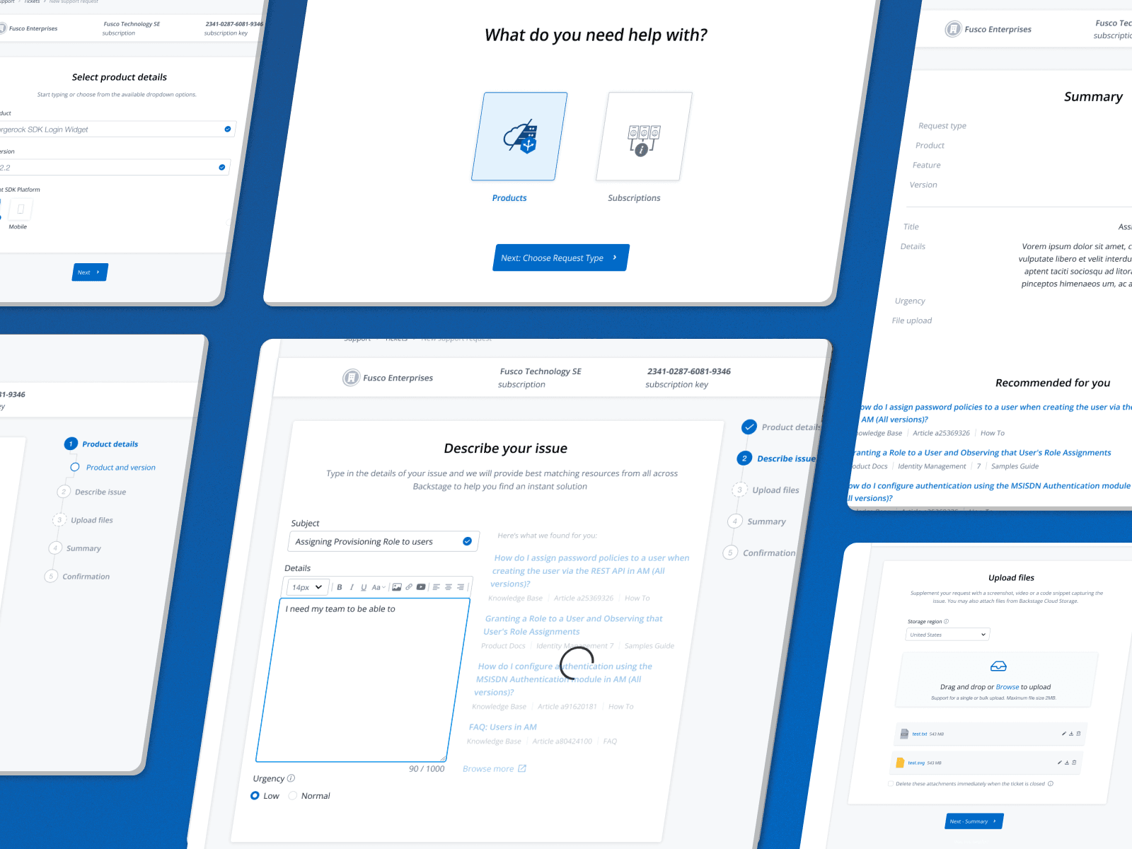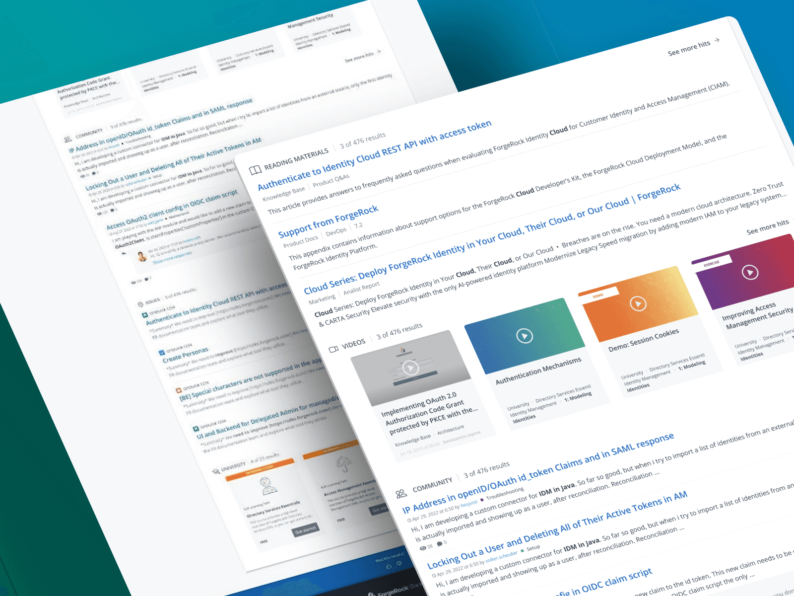

End-to-end a strategic redesign focused on information architecture, progression clarity and premium content discoverability.
01Challenge
The ForgeRock Training Platform offered on-demand learning, certifications and instructor-led courses, but users couldn't navigate it effectively enough to engage with what was available.
I led a strategic redesign focused on information architecture, progression clarity and premium content discoverability. The core intervention was structural: by rebuilding the content hierarchy and embedding clearer progression signals, I transformed the platform from a difficult-to-navigate repository into a learning ecosystem that aligned with both user needs and commercial objectives.
02Problem & Context
Users
Engineers, customers, partners and internal learners - ranging from anonymous free users to paid learning pass holders.
Business need
The platform served dual objectives, educational and commercial. Beyond driving product knowledge, it was a revenue stream through premium e-learning content and learning passes. Certification participation and long-term user retention were equally important success criteria.
Why it mattered
Despite the breadth of content available, users couldn't find what they needed or understand how the platform worked. The gap between what existed and what users could access wasn't a content problem - it was a structural one. Valuable material was going undiscovered, premium offerings were going underutilised, and monetisation opportunities were being missed not because users weren't interested, but because the experience made engagement too difficult.
03Role, Team & Constraints
My role
Process, information architecture, interaction design and stakeholder management end to end. Worked closely with Principal researcher on user research and testing.
Stakeholders
Training team, product stakeholders, engineering teams and learning content team.
Constraints
- Limited research participants reduced the scale of validation possible at each stage
- Project was deprioritised during roadmap shifts, affecting timeline and momentum
- Existing platform architecture constrained how radically the structure could shift
- Limited resources prevented deeper exploration of gamification - kept scope intentionally focused
04Research & Insights
I began with a cross-functional kickoff to align on business priorities before conducting user research, ensuring findings could be mapped directly to commercial goals.
Business context first.
Stakeholder sessions identified two primary business concerns: inconsistency with brand guidelines and a lack of content filtering. There was also an appetite for gamification to increase engagement - but this was treated as an enhancement, not a foundation.
User interviews revealed the real problem.
Four participants completed a series of structured tasks across the platform. The findings were consistent and significant:
- Architecture confusion. Users couldn't understand the relationships between courses, chapters, lessons and learning paths. The content hierarchy was opaque at every level.
- Broken visual language. Colour coding intended to communicate course paths and difficulty levels was consistently misread. Navigation labels didn't correspond clearly to what users found when they clicked them.
- Invisible premium content. Users were uncertain how to access or leverage premium offerings, even when they were available to them - a direct commercial risk.
- Calendar overload. Instructor-led course schedules appeared chaotic and overwhelming on first contact, creating friction before users even reached the enrolment flow.
Competitive landscape. Analysis of Salesforce, Microsoft Learn, Adobe Learning and Auth0 revealed a consistent industry pattern: clean design, minimalism, personalisation and structured progression. ForgeRock's direct competitor, Ping Identity, offered no comparable learning experience, representing a meaningful competitive advantage waiting to be activated.
05Key Decisions & Tradeoffs
Decision 1: Prioritise information architecture over visual redesign
Stakeholder instinct was to address brand inconsistency and add filtering. Research reframed the priority entirely.
- Why this: Navigation and hierarchy confusion were the primary source of friction. A visual refresh on top of a broken structure would have produced a better-looking version of the same problem.
- Tradeoff: Delayed visible design output in the early stages, which required stakeholder alignment during a period where the project was already under roadmap pressure. Reframing the problem statement was as much a communication challenge as a design one.
Decision 2: Remove an entire hierarchy layer
Rather than simplify incrementally, I made the call to eliminate a full level from the content hierarchy in collaboration with the training team.
- Why this: Reducing complexity directly improved comprehension. Users oriented faster and expressed more confidence navigating the restructured content. Naming changes were also introduced for labels that had consistently caused confusion in testing.
- Tradeoff: Required the content team to restructure existing material - this wasn't a design decision alone and needed cross-functional buy-in to execute without disrupting the existing catalogue.
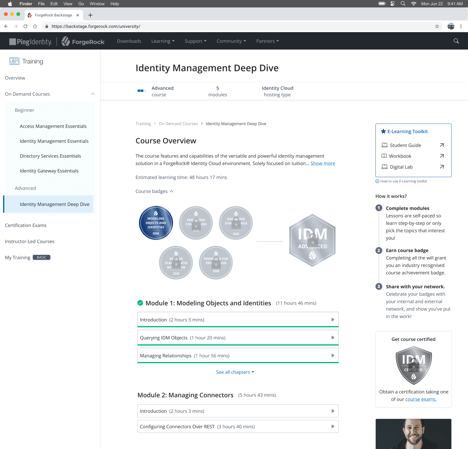
Decision 3: Connect badges into a progression model rather than treat them as isolated rewards
Testing revealed that users understood individual badges but couldn't connect them to a broader achievement framework or understand how micro-badges related to course-level badges.
- Why this: A survey of 23 respondents validated that badge layout A - which emphasised progression toward a course badge in left-to-right order - was the strongest performer, selected by 45% of participants. Proximity between milestone and course badges reduced cognitive load and strengthened the sense of progression.
- Tradeoff: A more sophisticated gamification system was scoped out due to resource and research constraints. The decision was to do the simpler version well - establish clear progression logic, rather than attempt something more ambitious that couldn't be validated properly within the project timeline.
06Solution
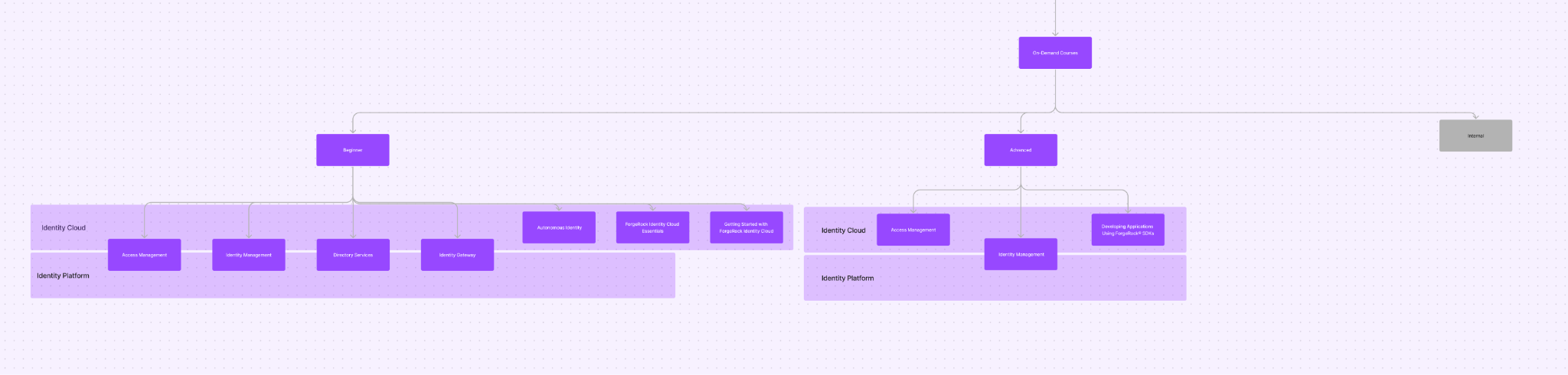
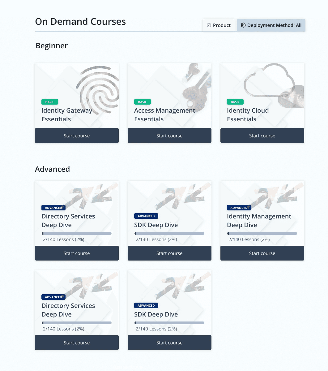
Restructured information architecture
In collaborative sessions with the training team, I rebuilt the content structure from the ground up: dividing content by difficulty level, implementing naming changes for confusing labels, and removing a full hierarchy layer. The result was a structure users could orient within on first contact.
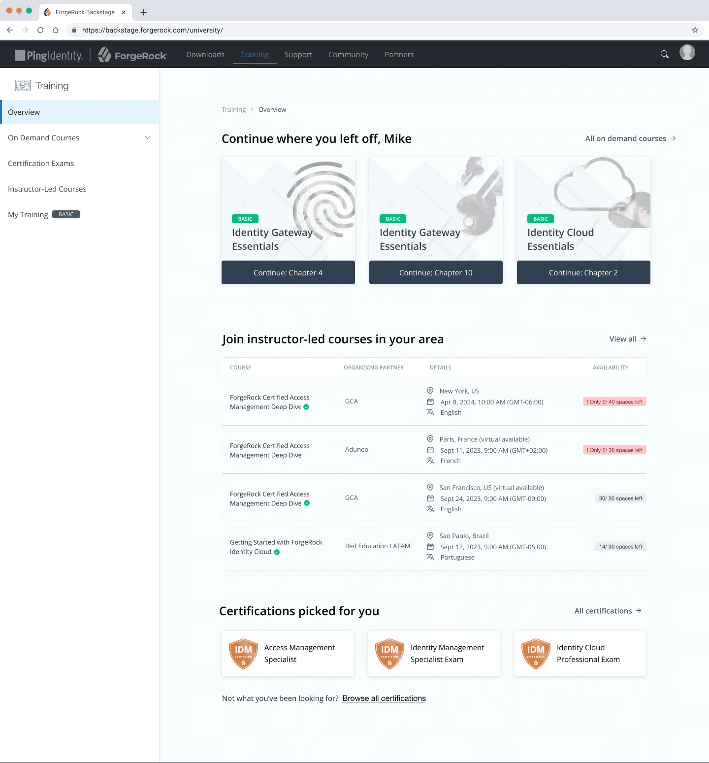
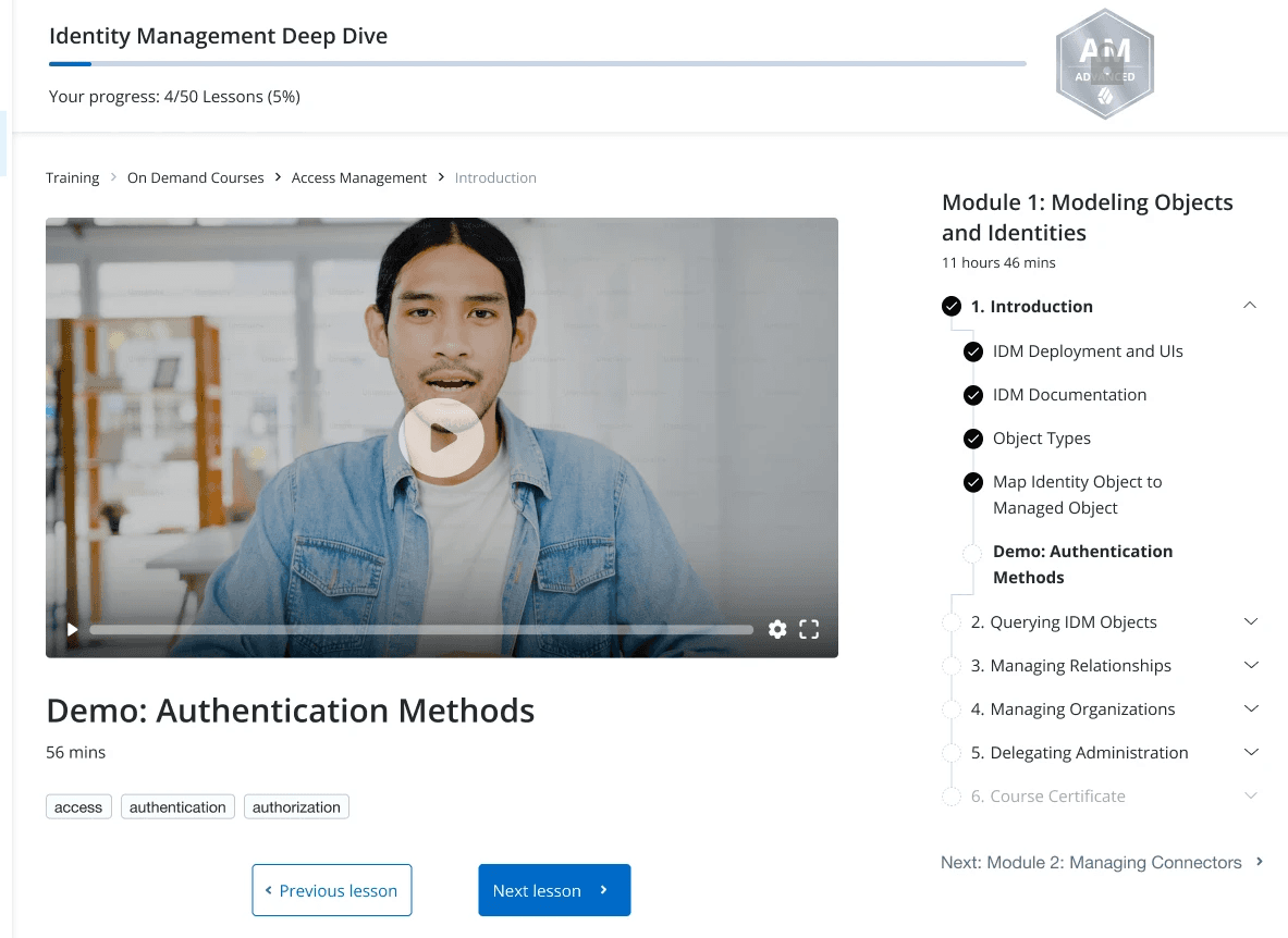
Tracked progression
A new overview page designed to serve both new and returning users: surfacing training offerings at a glance, giving logged-in users a clear resumption point, and surfacing live events, new courses and certification pathways in a single destination.
Improved content discovery
Added grouping and filtering, giving users meaningful ways to find relevant content without needing to understand the full catalogue structure first.
Refined badge and progression framework
Badge structures were redesigned to connect individual achievements into a coherent progression model. Micro-badges were placed in closer visual relationship to course-level badges, with clearer instructions on how completing milestones leads to course badge unlock. Time estimates and progress indicators were retained and reinforced across course, module, chapter and lesson levels.
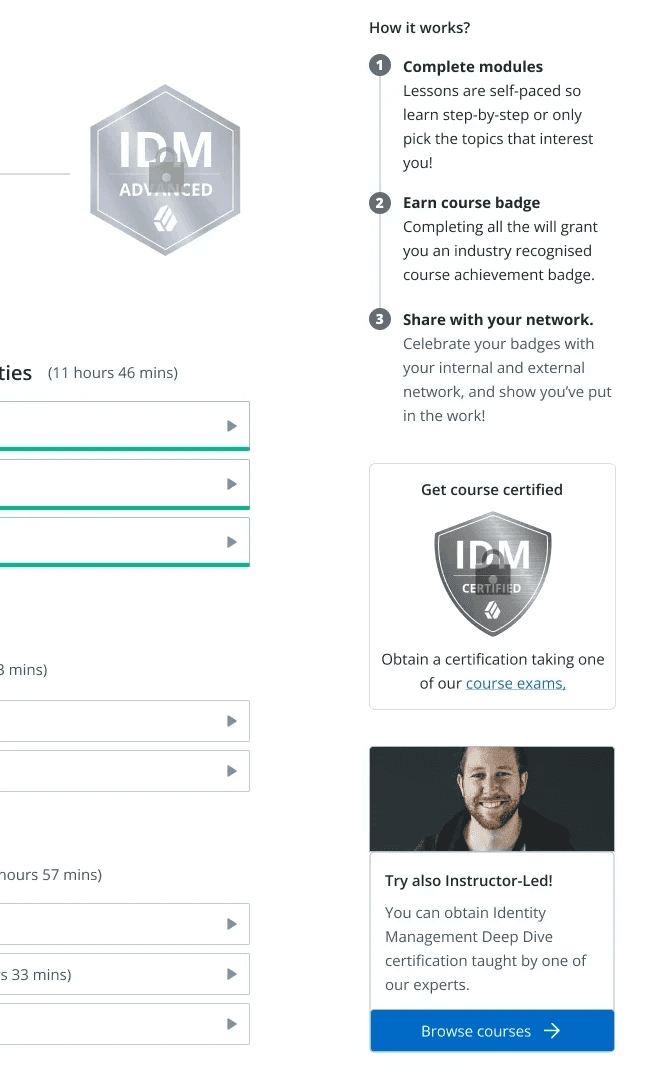
Premium content visibility
Premium learning opportunities were surfaced more prominently and framed more clearly reducing the gap between users understanding what was available and acting on it.
07Results & Impact
Without longitudinal data available, impact is drawn from usability testing and iterative feedback, with commercial metrics as the intended future measure.
User impact
Testing demonstrated meaningful improvement in users' ability to understand course hierarchy, badge progression and learning pathways. The badge layout survey (23 responses) provided clear directional signal on the progression framework. Users responded positively to time estimates, progress indicators and achievement tracking - validating that clarity interventions were landing as intended.
Business impact
The redesign directly addressed the structural barriers limiting both engagement and monetisation. By making premium content more visible and the platform easier to navigate, it closed the gap between content availability and content discovery - the core commercial risk identified at the outset.
Strategic impact
The project reframed learning architecture as a core product strategy. ForgeRock held a meaningful competitive advantage over Ping Identity in the depth of its learning offering, this redesign positioned the platform to activate that advantage rather than leave it latent.
08Reflection
What I'd do differently
With a larger research pool available, I would have validated the hierarchy changes earlier and more rigorously before moving to high-fidelity. The limited participant count meant some structural decisions carried further than was comfortable before they were tested. I'd also have pushed to establish baseline metrics before the project began - the absence of pre-launch data made it harder to demonstrate impact at the close.
What remains unsolved
- Whether the progression framework sustains motivation over longer learning journeys, beyond what short-term testing could reveal
- How the architecture scales as content volume grows: does simplification hold, or does complexity creep back in over time?
- Video transcripts were flagged as a significant accessibility gap by a partner participant
- Longitudinal measurement of engagement and retention is absent; the true impact of the redesign isn't fully knowable without it